PLAY
Skills Used:
Project Management, Creative Direction, Book Design
Project Management, Creative Direction, Book Design
Tools Used:
InDesign, Illustrator, Photoshop, Cinema 4D
InDesign, Illustrator, Photoshop, Cinema 4D
Collaborators:
Ellie Gramm, Jackson Knight, Rebekah Smith
Ellie Gramm, Jackson Knight, Rebekah Smith
Awards:
AMERICAN ADVERTISING AWARDS GREENVILLE 2024: Gold Addy - Special Event Materials
AMERICAN ADVERTISING AWARDS GREENVILLE 2024: Gold Addy - Special Event Materials
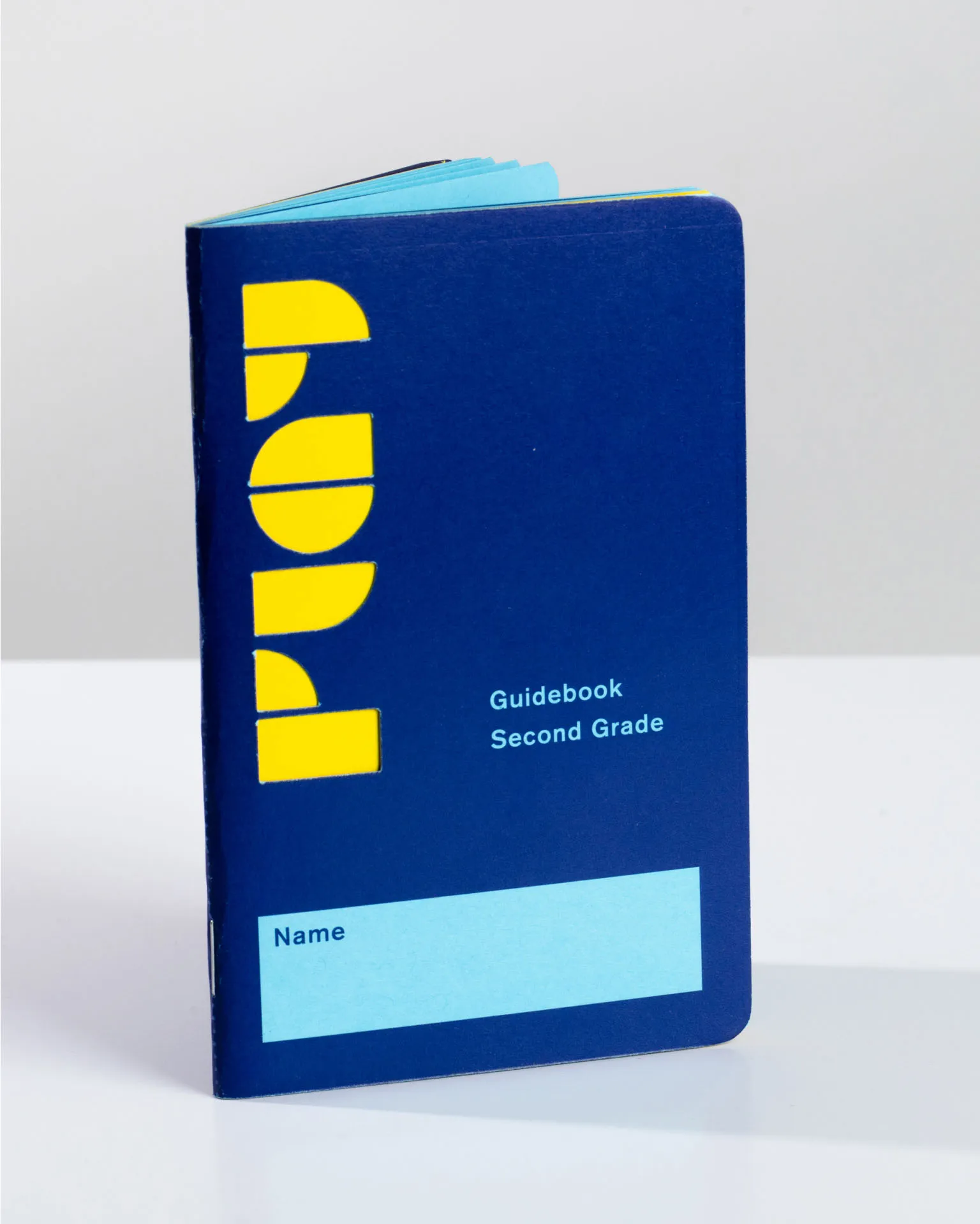
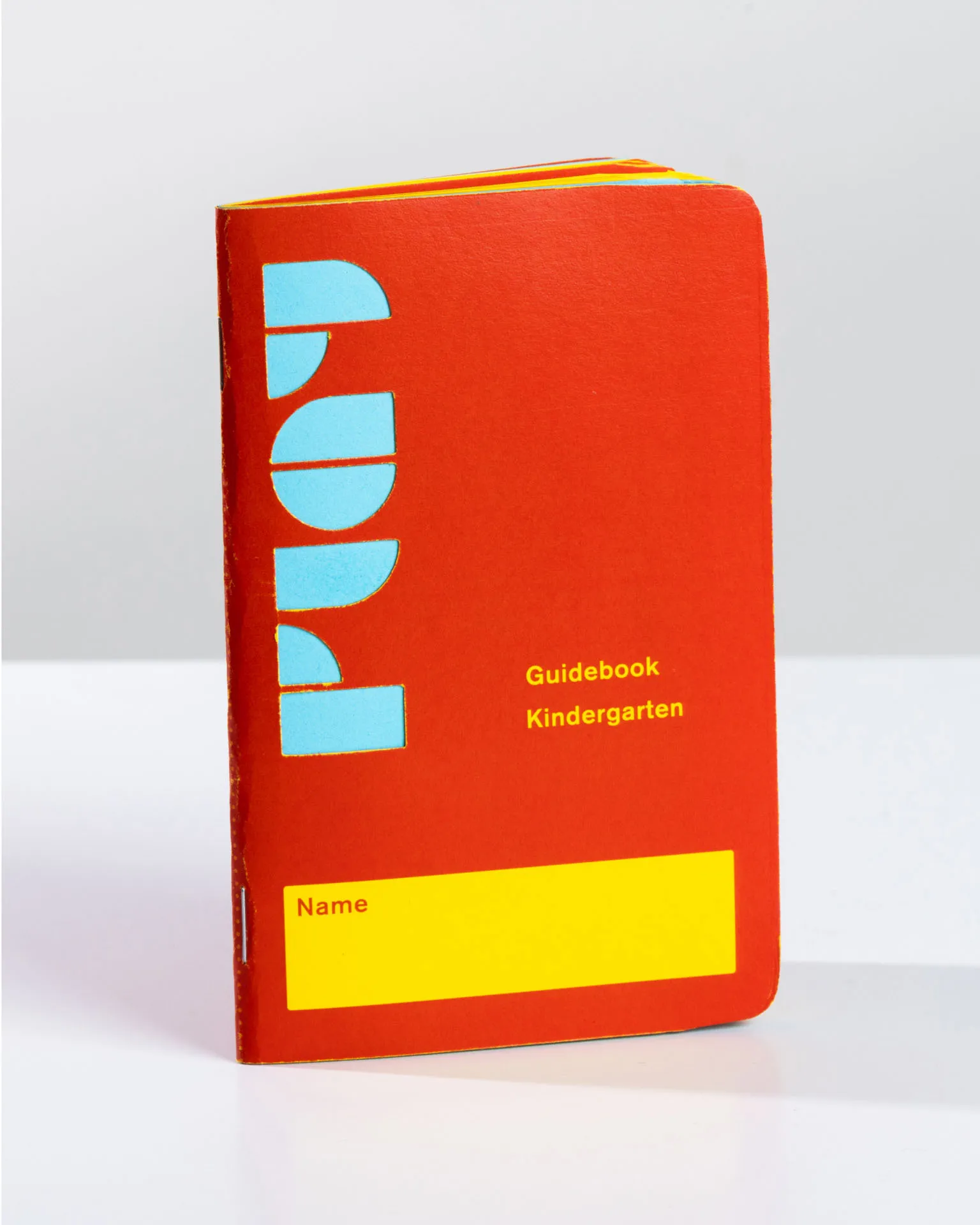
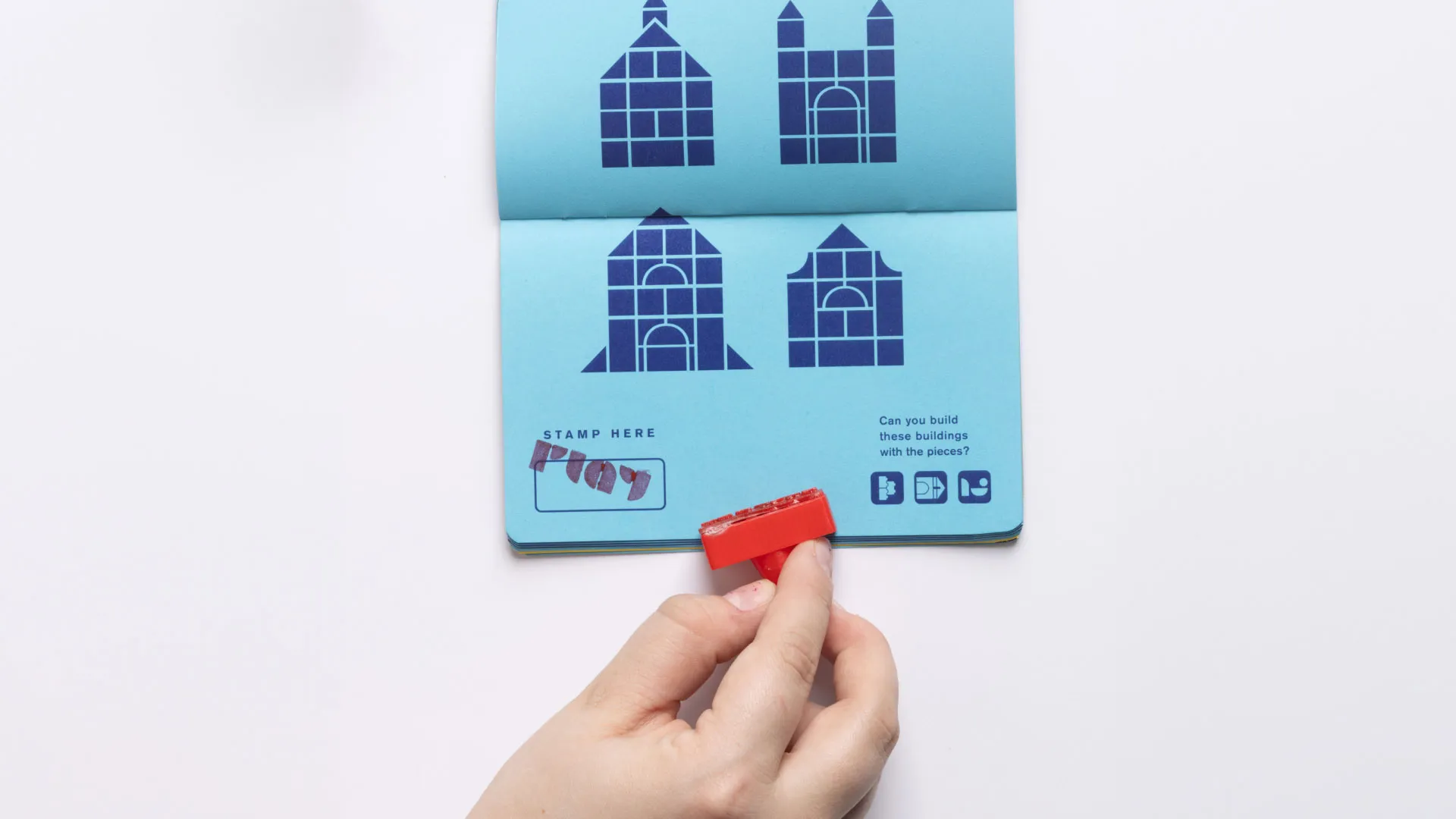
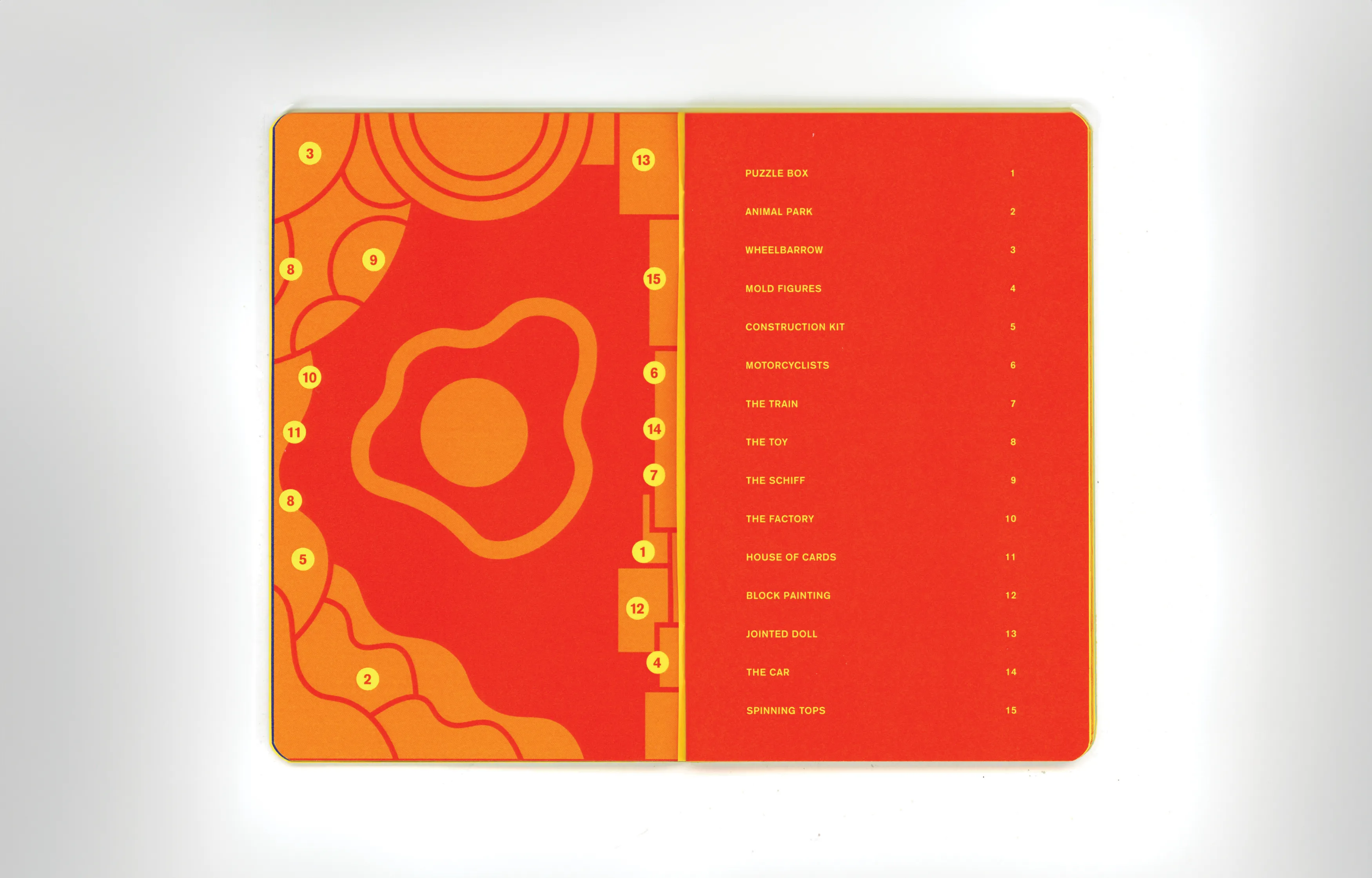
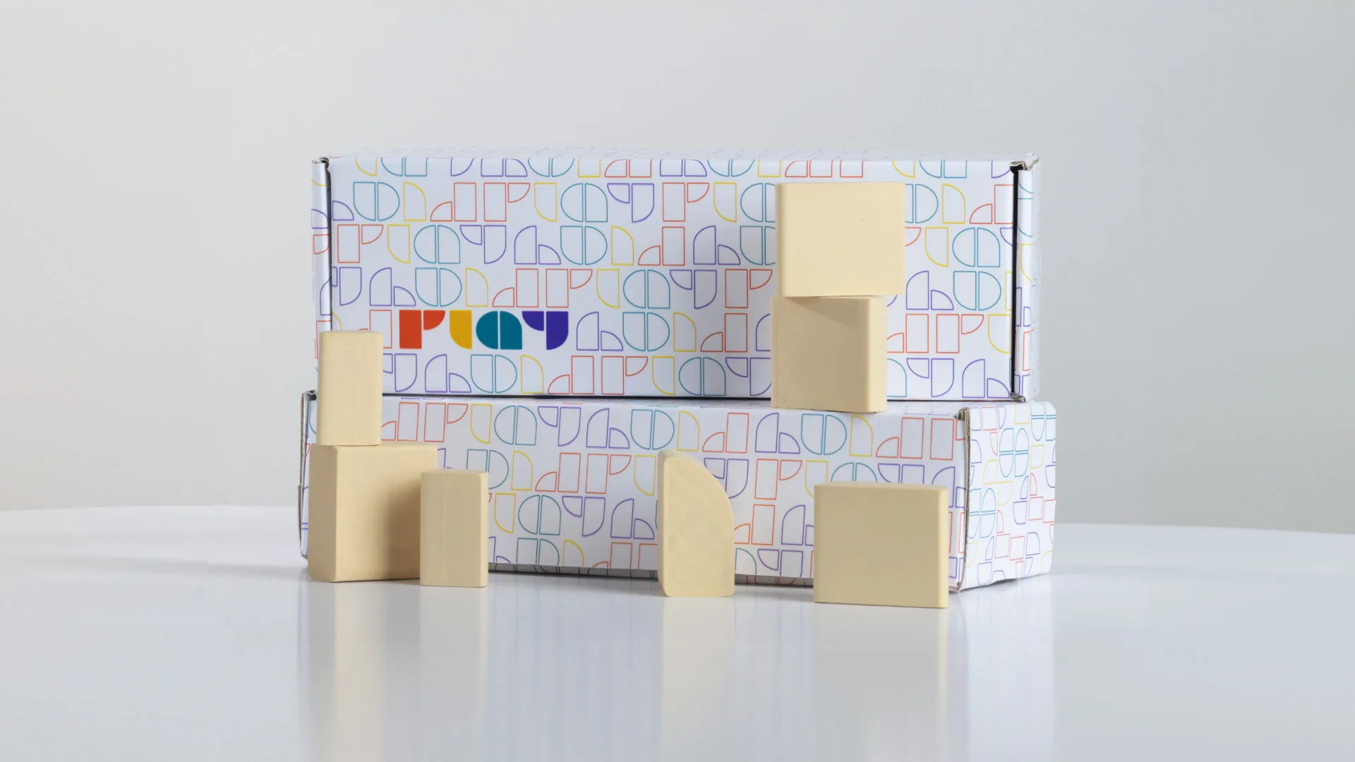
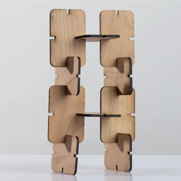
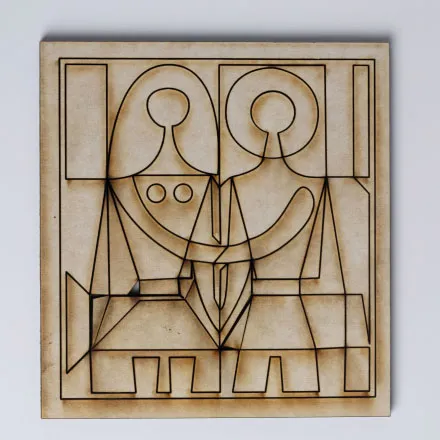
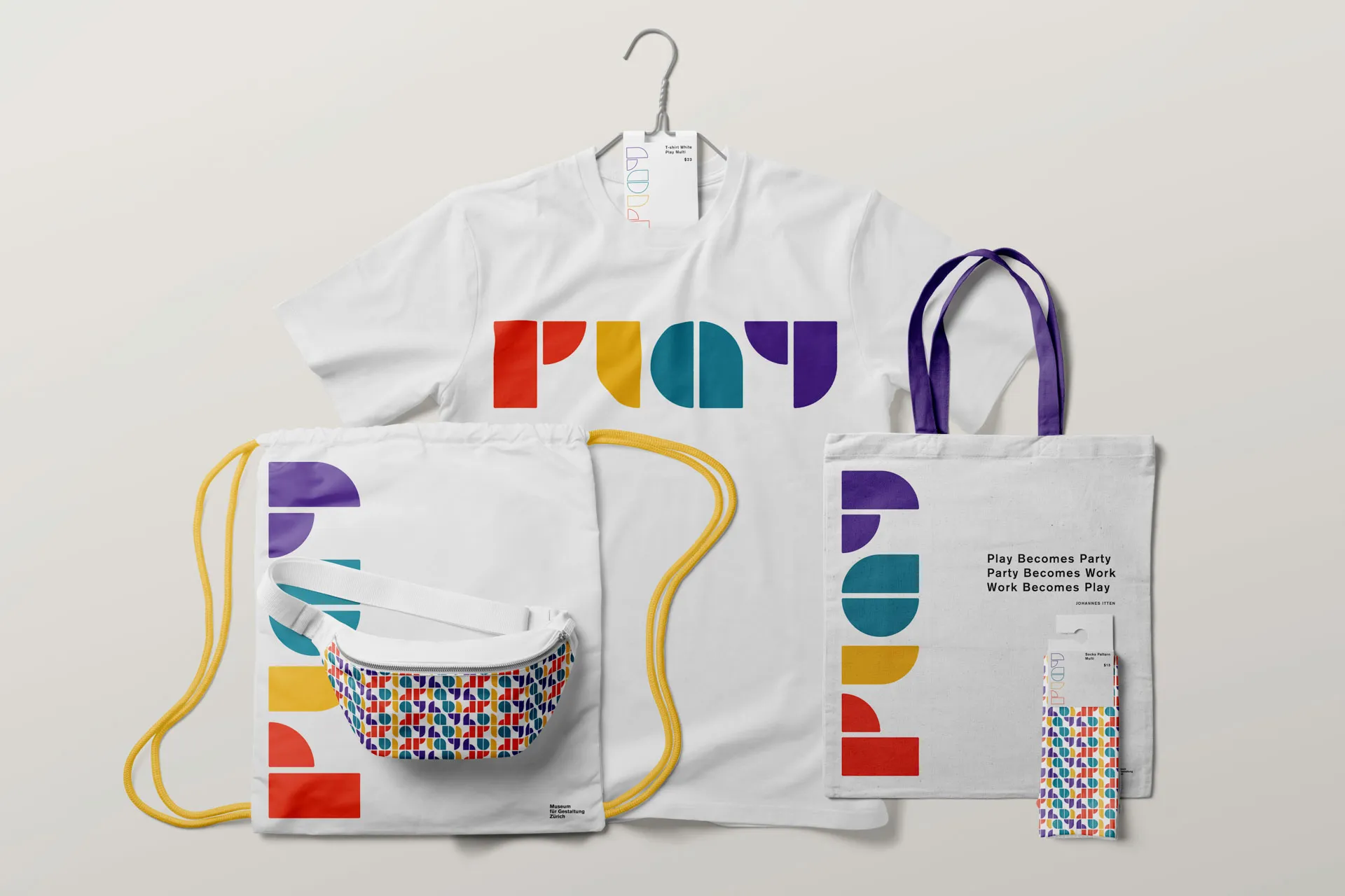
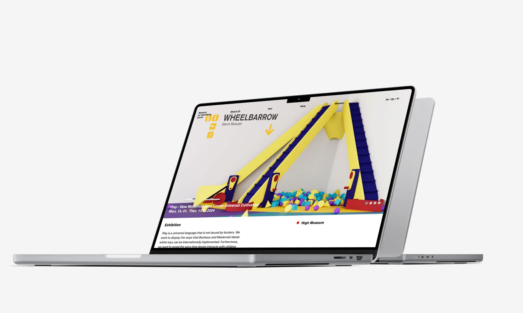
When raising a child, it’s important to understand the many factors that shape their development, especially the impact of play. "Play" is a conceptual exhibition sponsored by für Gestaltung Zürich, designed for children to explore on their own. The exhibition aims to highlight the universal nature of play, which is rooted in modernist ideals. It features works by toy designers from Czechia, America, Switzerland, the Netherlands, and Germany. To enrich the experience, age-specific field guides were created, all designed in the Swiss international style. The project showcases how Bauhaus and Modernist principles in toy design can transcend international boundaries, asserting that play is a universal language.
Student Work


Opportunity
We wanted to display the ways that Bauhaus and Modernist ideals within toys can be internationally implemented. Play is a universal language that is not bound by borders. Furthermore, we want to reveal the ways that design interacts with children and insight into parents a consideration of these facts.
Outcome
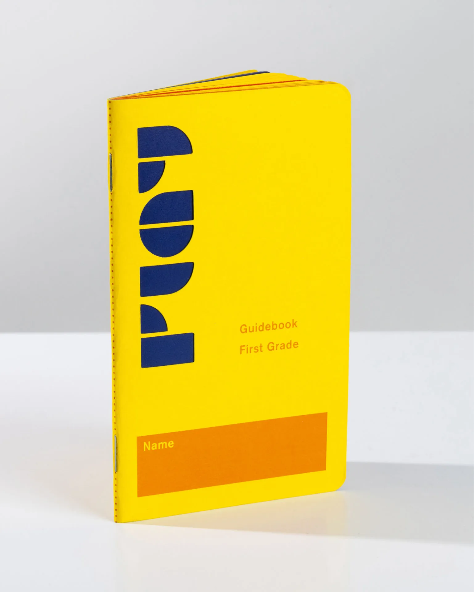
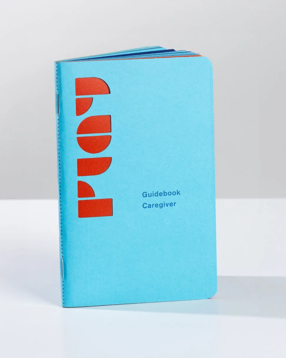
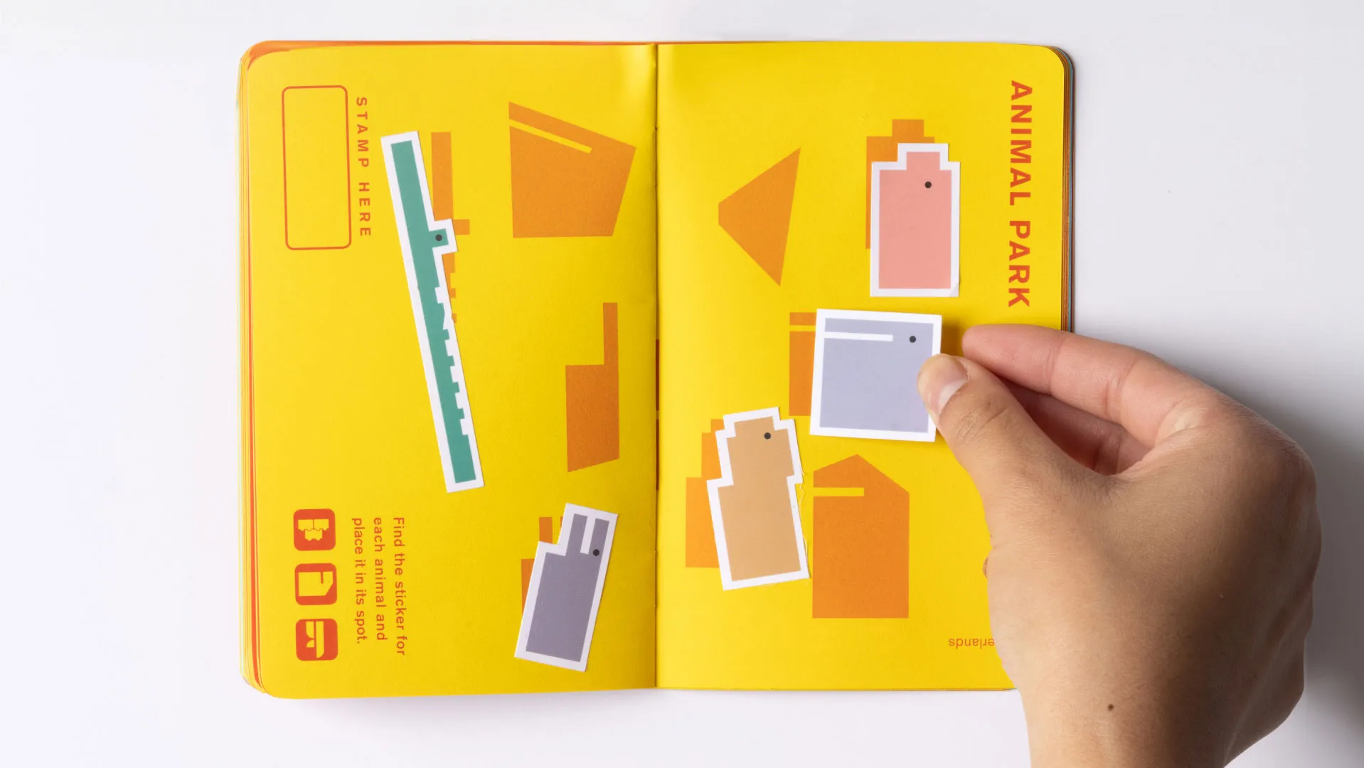
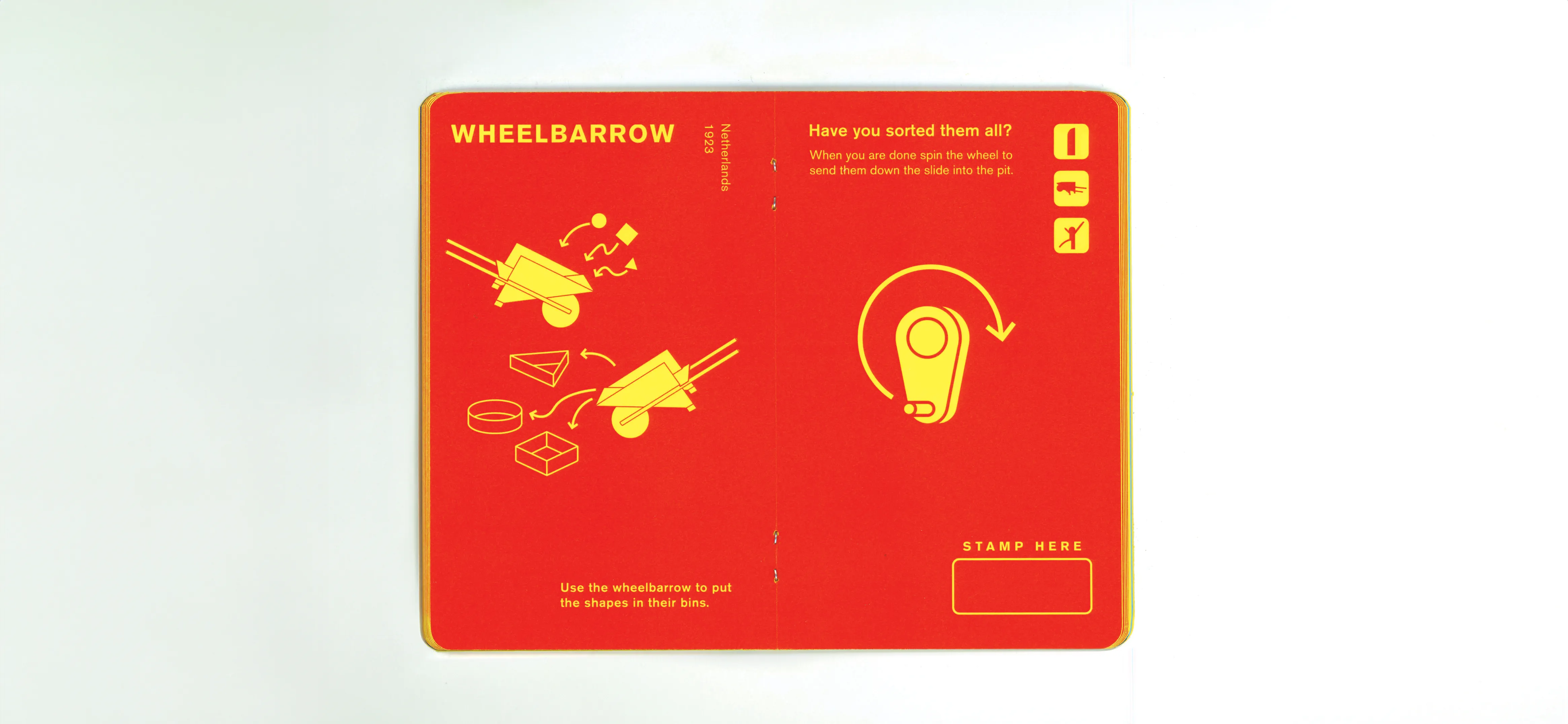
As a team, we created a children’s exhibition sponsored by für Gestaltung Zürich that displays a selection of works by toy designers who embodied reductive and foundational principles. All designers worked between the years of 1920 to 1970 and are from the countries of Czechia, America, Switzerland, Netherlands, or Germany. This exhibit is accompanied by guidebooks for children and an informative booklet for caregivers. In order to make an experience that is cohesive throughout cultures, the exhibit and guidebooks were designed with the Swiss international style.

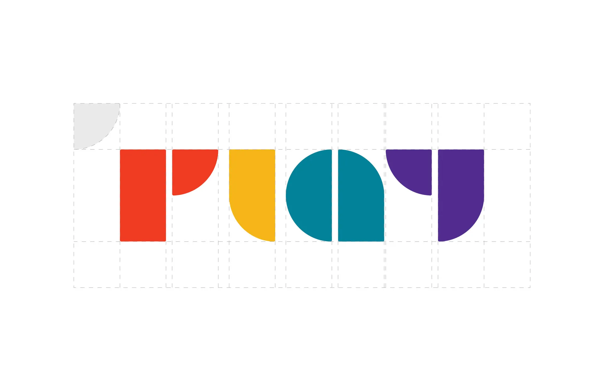
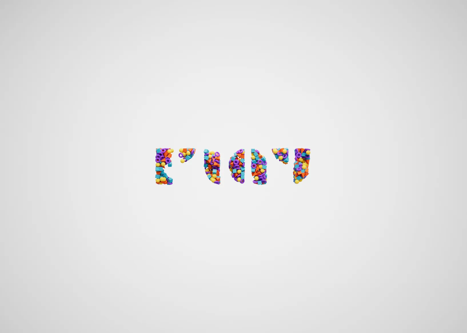
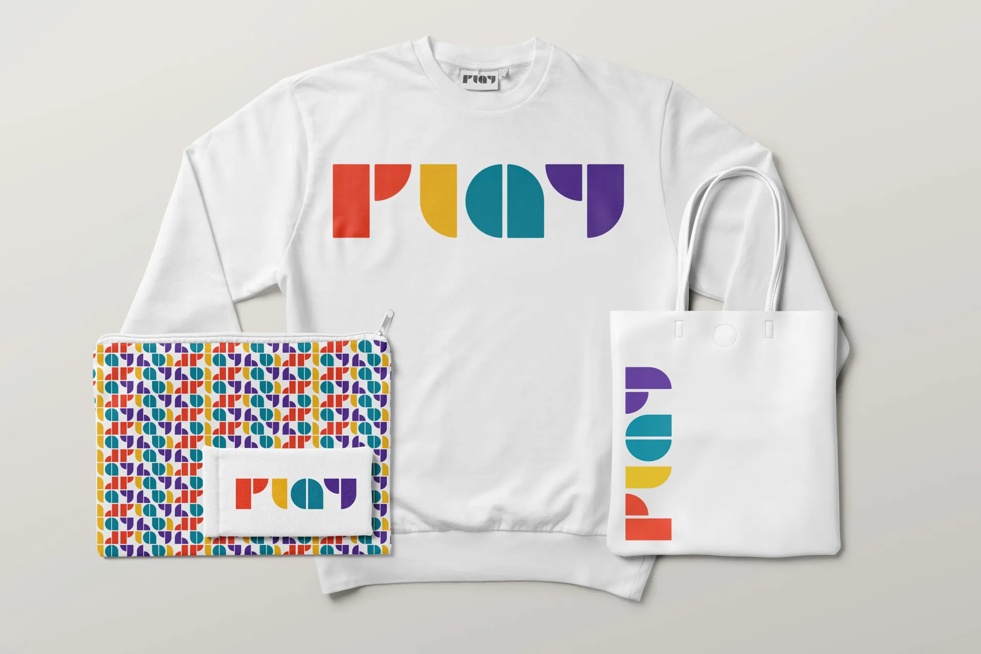
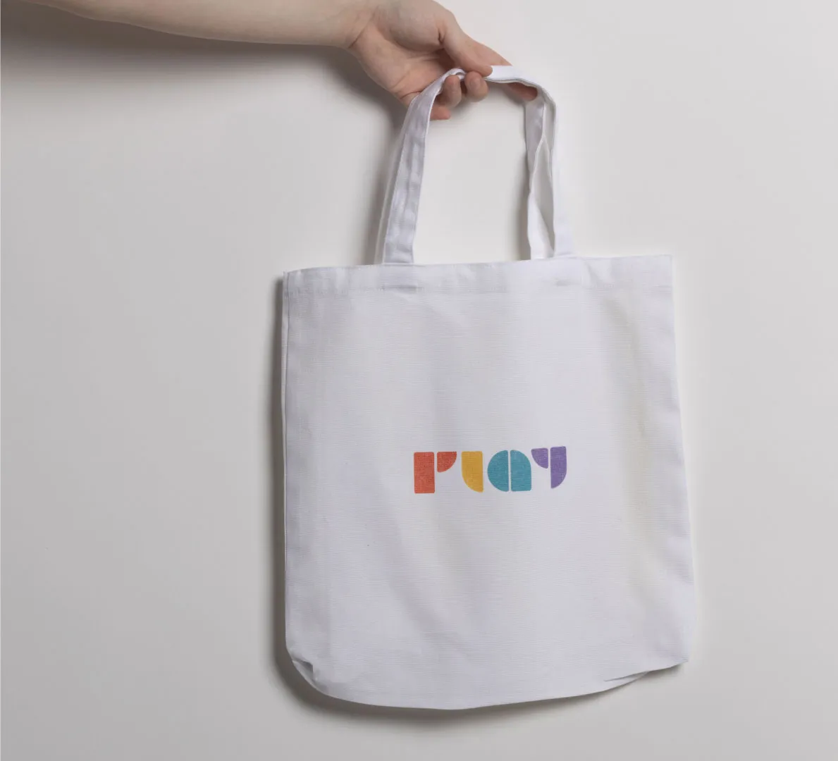
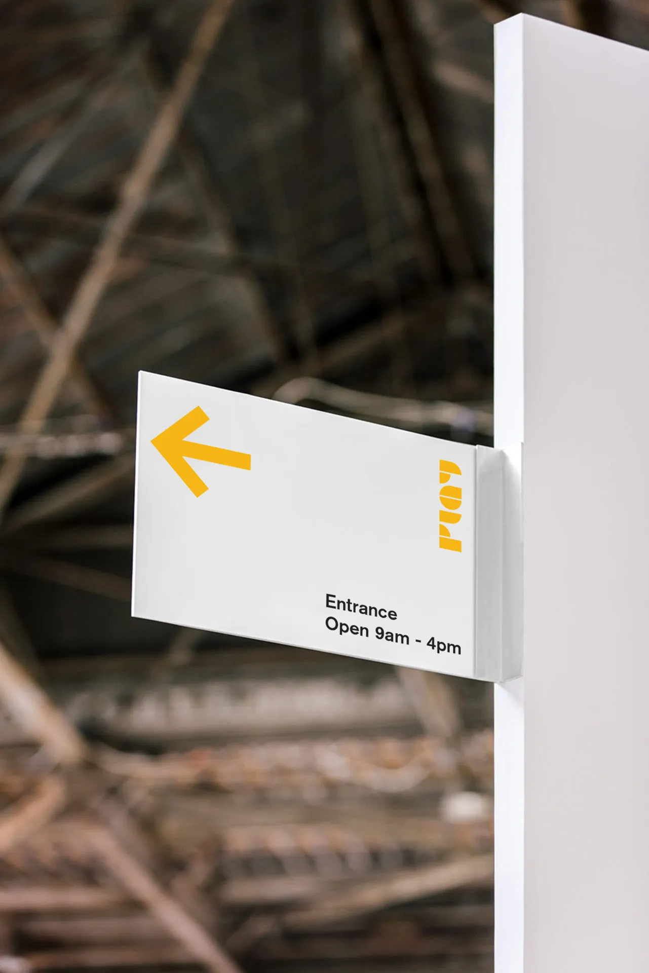
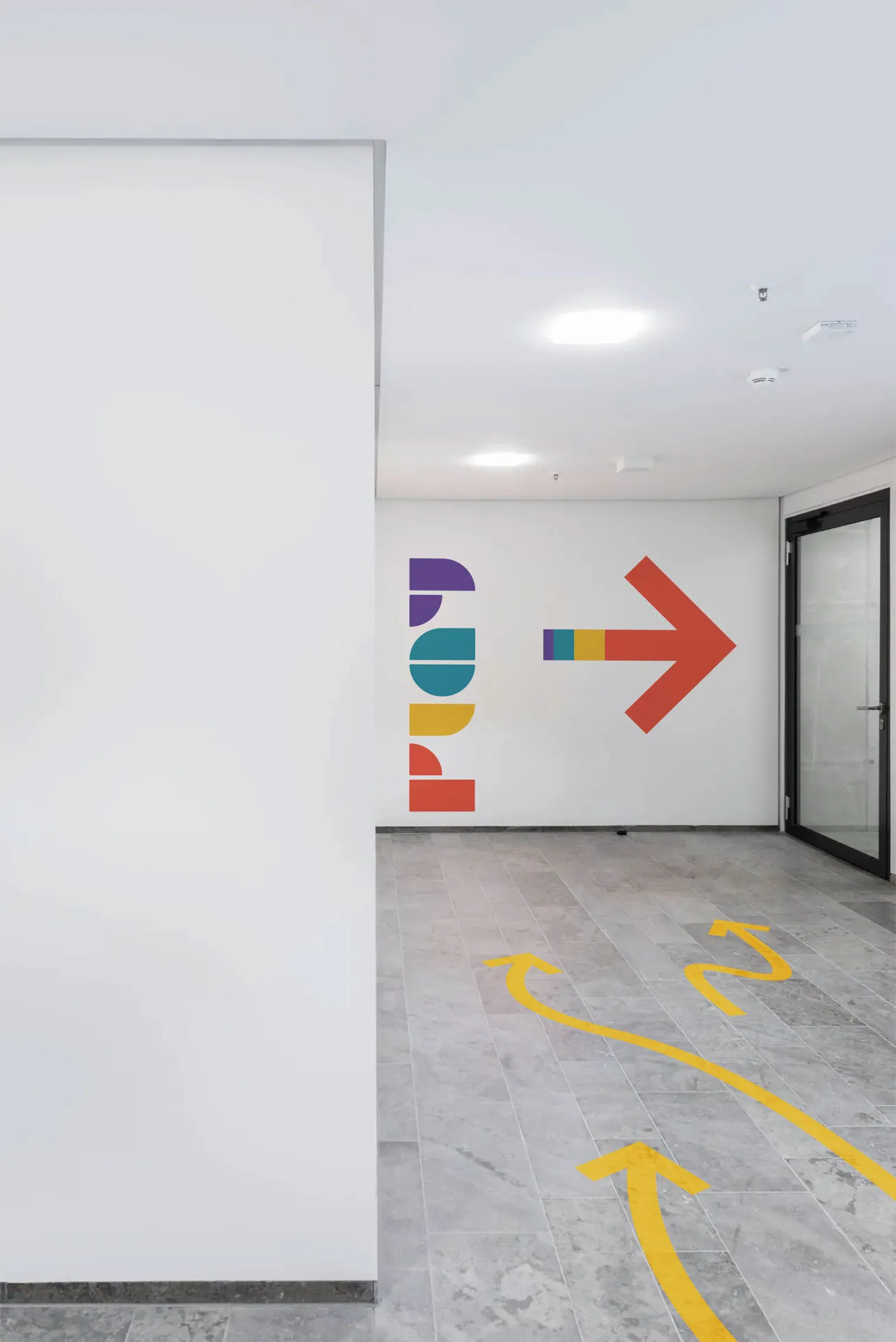
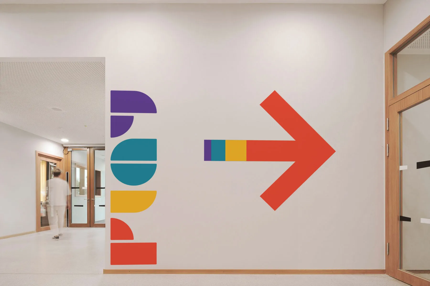
Mark
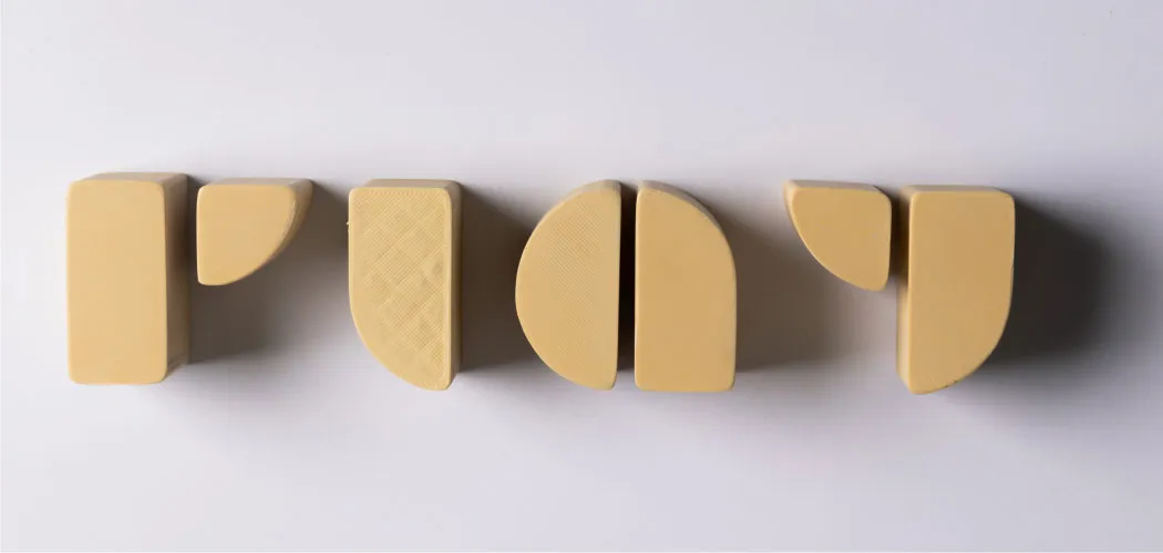
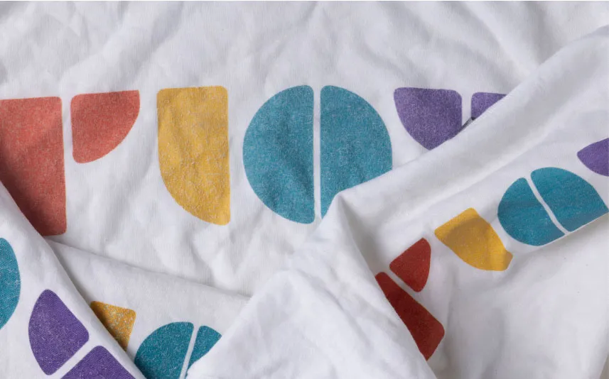
The mark was inspired by the typefaces of Josepf Albers, specifically Architype Albers. The forms are simple, modular, and meant to mimic blocks that children play with. The corners are slightly rounded to create a softer expression. Another important aspect of the mark is that there are no concentric forms, which is important since it would need to be capable of being die-cut. The mark can also be deconstructed to create a variety of different patterns.
Typeface
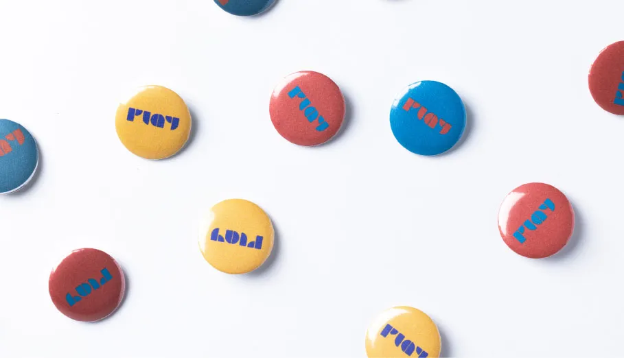
The typeface we chose for the exhibition is Akzidenz Grotesk. It was chosen for its simplicity, legibility, and modernist expression. It was important that all documents were extremely legible, but we still wanted to maintain a connection to the identity of für Gestaltung Zürich.
Color Palette
When tackling the color palette for the exhibition's identity we knew it had to be primary in essence to connect to ur message and forms but we still wanted it to stand out against the myriad of other children-focused identities. To solve this we started with the base colors of red, blue, and yellow, and began branching off of them. We then stepped back and analyzed our branches and created a harmonious collection of colors that were distinctive but still felt primary.
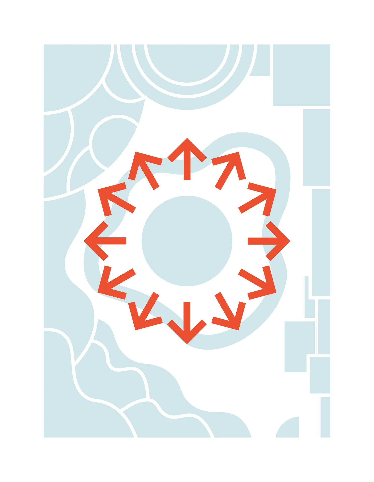
Exhibit
The exhibit space was designed to promote exploration and self-education within the children and allow for careful examination from the caregivers. The floorplan is extremely open with the different sections of the exhibition following the edges of the space. In the center of the space is a circular seating area for the caregivers. Children are allowed to run free and explore on their own as guided by their booklet. The parents on the other hand are encouraged to sit and watch the children play as they read their booklet. The caregiver can read about the intention and design of each toy and then actually see its effects on the children in real-time.