NOTION
Skills Used:
Interface Design, Experience Design
Interface Design, Experience Design
Tools Used:
Figma, Photoshop
Figma, Photoshop
Collaborators:
Awards:
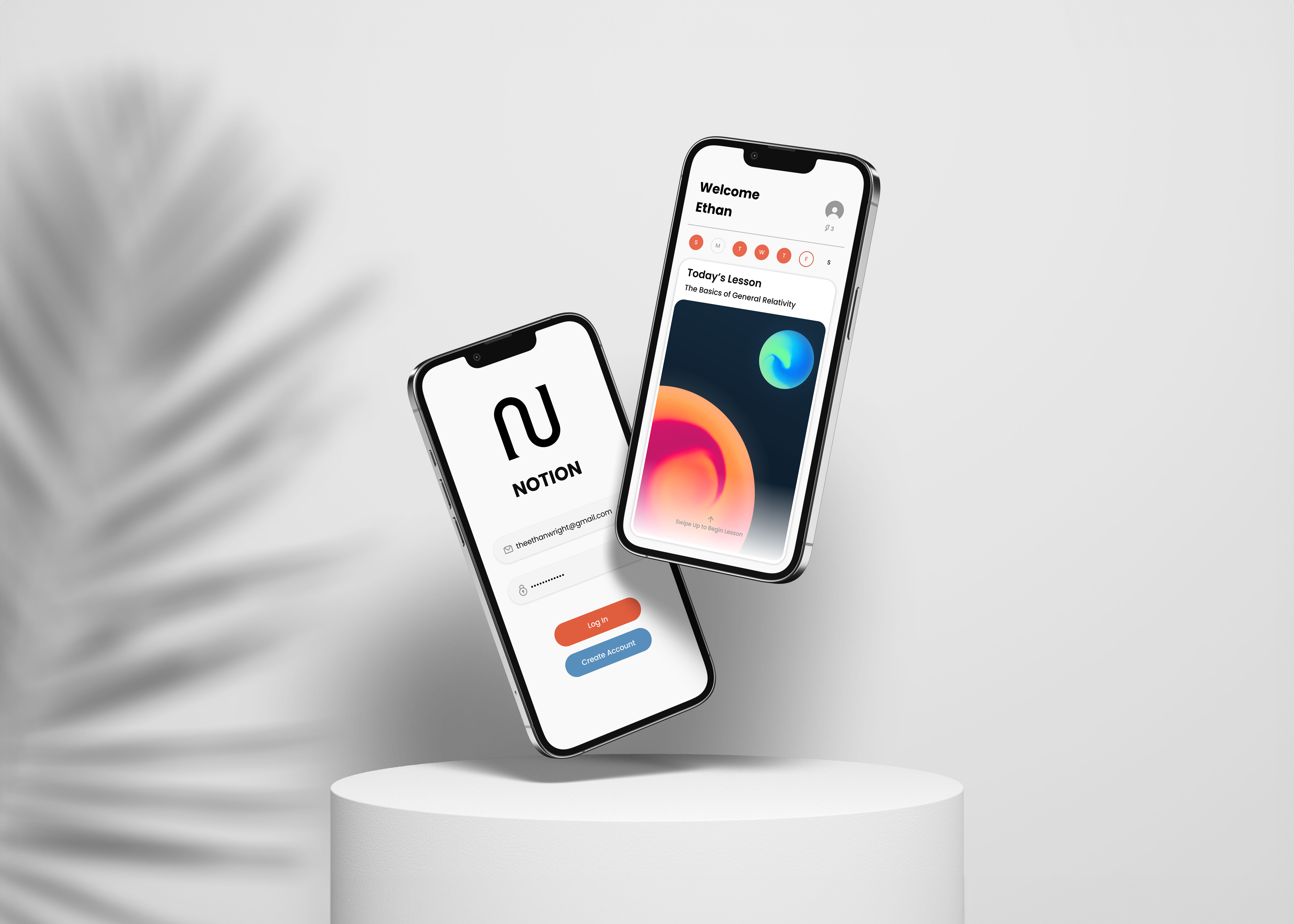
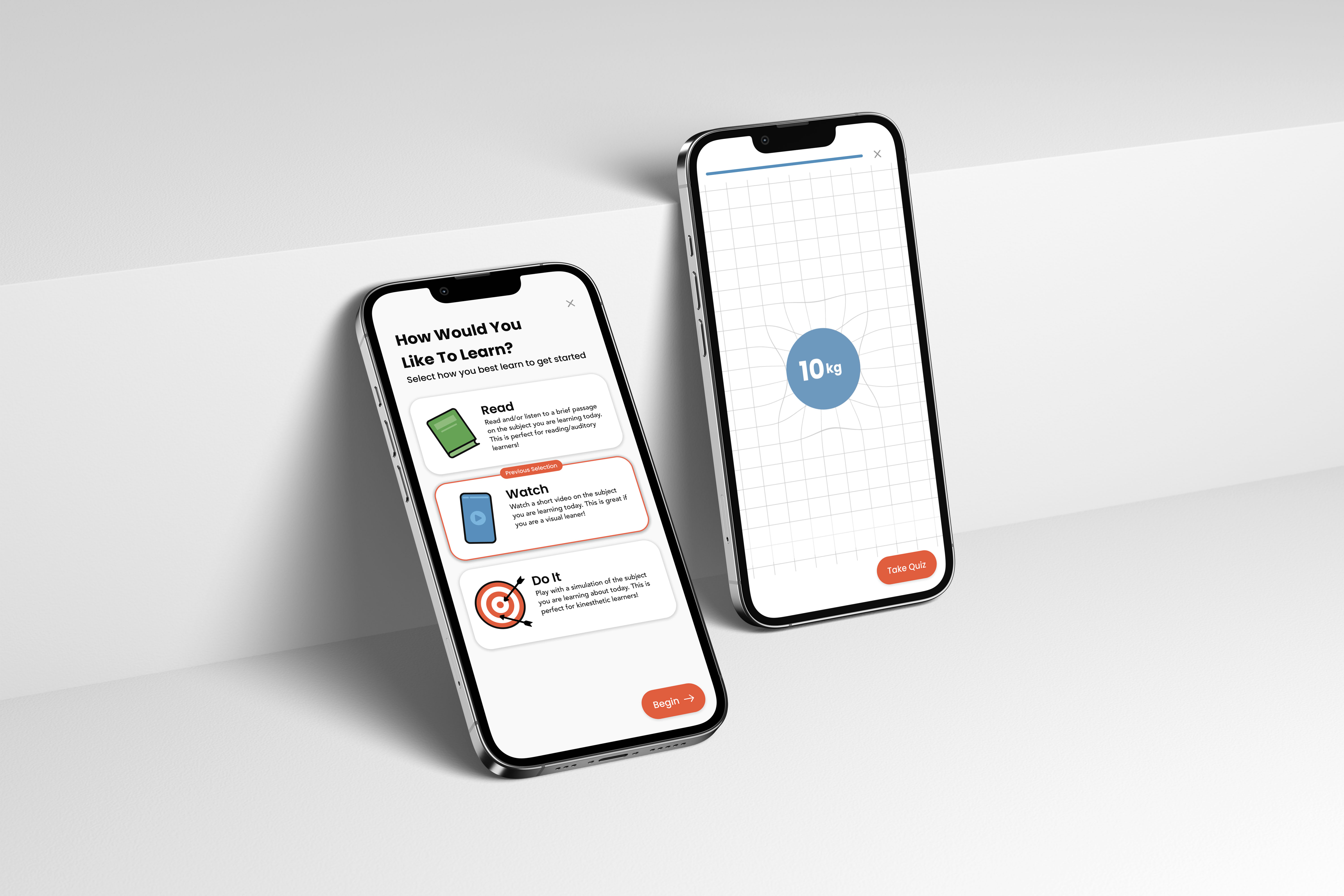
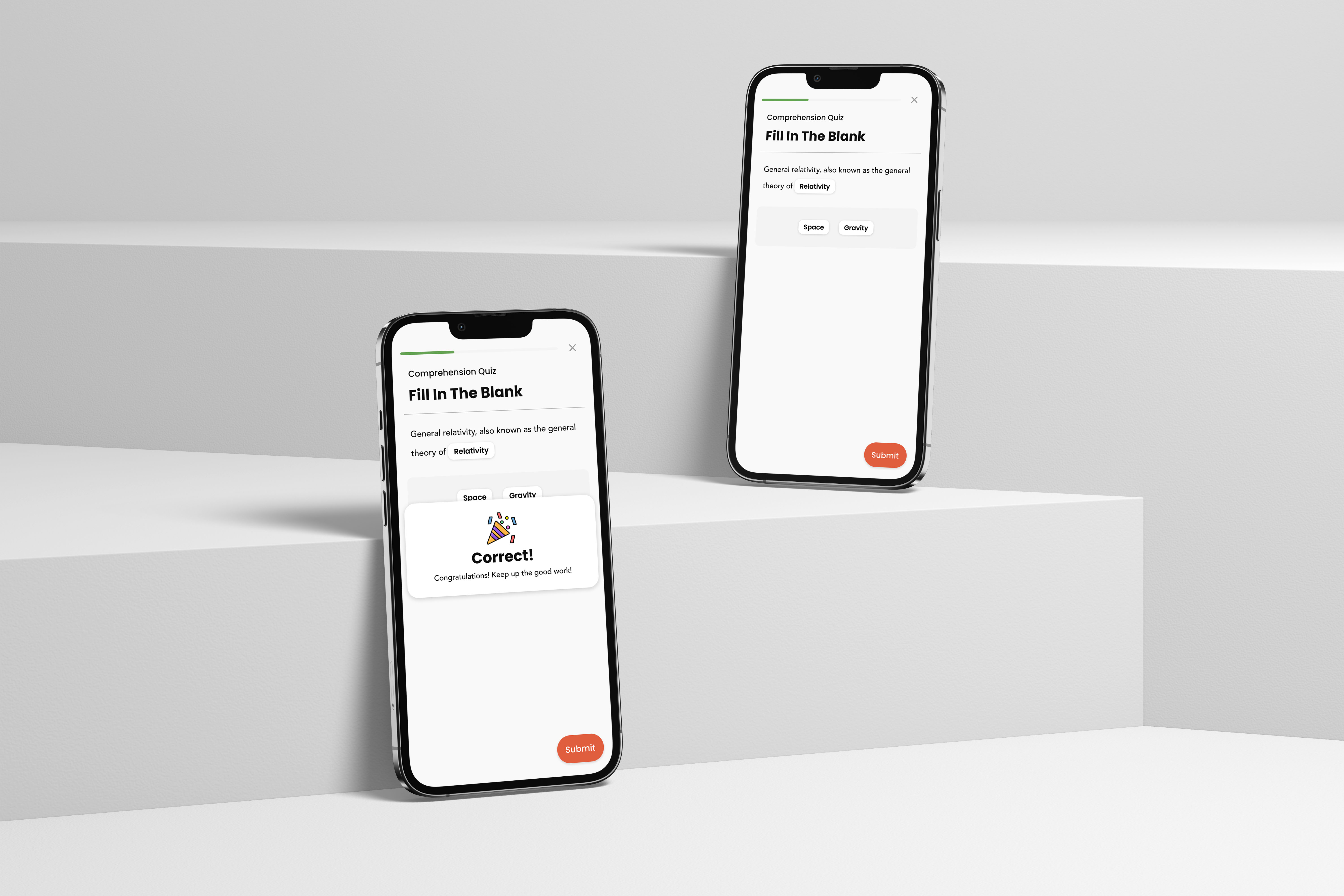
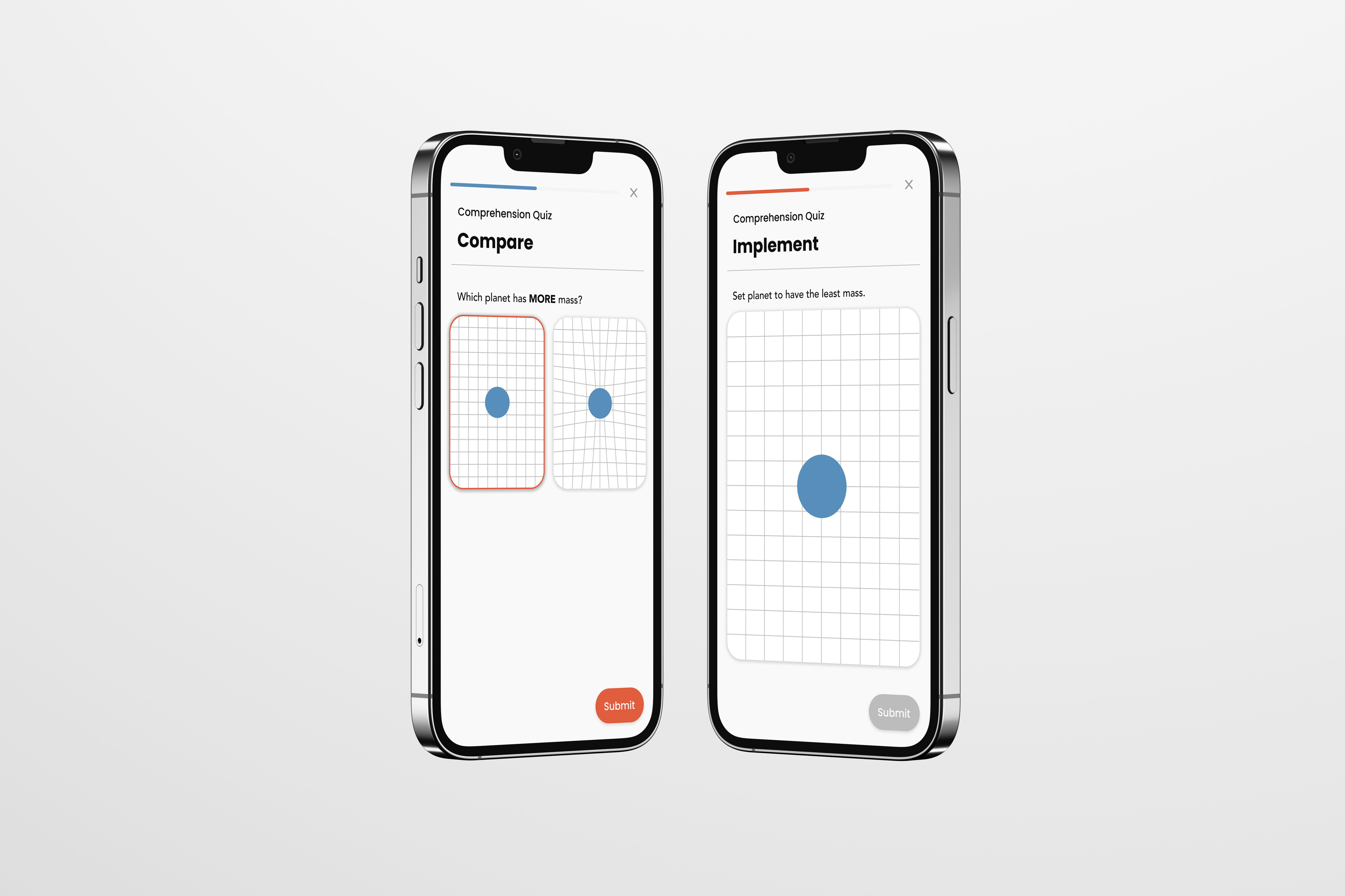
This project aims to create a customizable app for education, catering to various learning styles. The app offers three learning methods (reading, watching, doing) to accommodate different learning styles. It incorporates a friendly interface with soft aesthetics and calming colors. Testing methods align with each learning style, ensuring comprehensive understanding. The app aims to make learning enjoyable and accessible, empowering students to embrace education in their preferred way.
Brief
What if there was a way people could choose how they learn? Learning is a part of everyday life. It is impossible to escape it, but often people form a contempt for learning. This is a result of their experiences with learning in academic settings. Different people learn in different ways but, schools tend to teach using only methods that favor the majority. This leaves the minority lost and with a disdain for education. We must find a way to make instruction conform to the student rather than the student to the instruction.
One way of accomplishing this is through the creation of an educational app. This will allow students to gain a new love for learning. It will help students to learn in a way that fits them rather than having to endure a standard method of education. It will unlock a fountain of knowledge that, for many, was once a tremendous struggle to obtain.
The process must involve ideating, prototyping, testing, and designing a Single Function Mobile App. The audience will be the universal “College Students.” The app must be well defined with clear answers to what the app is, what it does, and what its “special sauce” is. The process will work through the digital product process, testing and iterating throughout. The functionality must be simple and direct.
Main Goal
This app must allow students, ages 18 to 22, to quickly learn complex concepts in their preferred method of instruction every day. In order to do this it needs to be intuitive and effortlessly comprehensible. It must be aesthetically friendly and inviting. Tasks have to feel exciting and rewarding rather than intense and academic.
20 Concepts
The process began by devising 20 what if concepts to ideate potential app ideas.
Research
Research
After deciding on a concept I began collecting examples of user experiences in my everyday life to inform my app.
After researching UX examples in my every day life I started researching other educational apps and collecting and compiling examples of their user interfaces.
Lofi Prototype R1
After researching I created a lofi prototype of my app interface and user flow. The prototype was made only from simple construction paper and glue.
Testing
After creating the lofi prototype I began testing it on various users with a specific task list. This allowed me to better understand the users and how they interacted with the interface.
Task list:Start Lesson Select Method of Instruction Read Turn on reader Scroll Take Quiz Watch Pause Skip Ahead Take Quiz DoIt Change Values Take Quiz Select Answer Submit Answer
Notes from testing:Input boxes on the Do It screen were not obvious to the user People did not click on the input boxes on the Do It screen Keyboard should pop up automatically when a user reaches the Do It screen The majority of users selected the Do It screen. Setting buttons for playback were too small on the Watch screen The method of skipping was not obvious to the user on the Watch screen The reader button was very clear to the user on the Read screen
Task list:
Notes from testing:
Lofi Prototype R2
After testing I took the feedback I received and made a second revision of the prototype with changes based on the feedback.
Testing
After creating the second revision I began testing it and taking note of how the users interacted with it as they followed a set task list.
Task List:
Start Lesson Select Method of Instruction Read Turn on reader Scroll Take Quiz Watch Pause Skip Ahead Take Quiz DoIt Change Values Take Quiz Select Answer Submit Answer
Notes from testing:User hesitated when choosing method of instruction User found controls on the right-hand side of the Watch page easy to use Controls on the right-hand may be more difficult for left-handed people User pressed the play button to skip User thought having the next button on the instruction selection page to be more helpful User understood the Do It page better than previous revision User clicked the circle rather than pinching to change size of circle on the Do It page Users seemed to better understand the options on the Watch page better than previous revision
Notes from testing:
Style Tile R1
After testing the second revision of the lofi prototype began designing a style tile that would inform both aesthetics and the system of my app.
Style Tile R2
My fellow students then critiqued my style tile. From this feedback I created a second revised style tile.
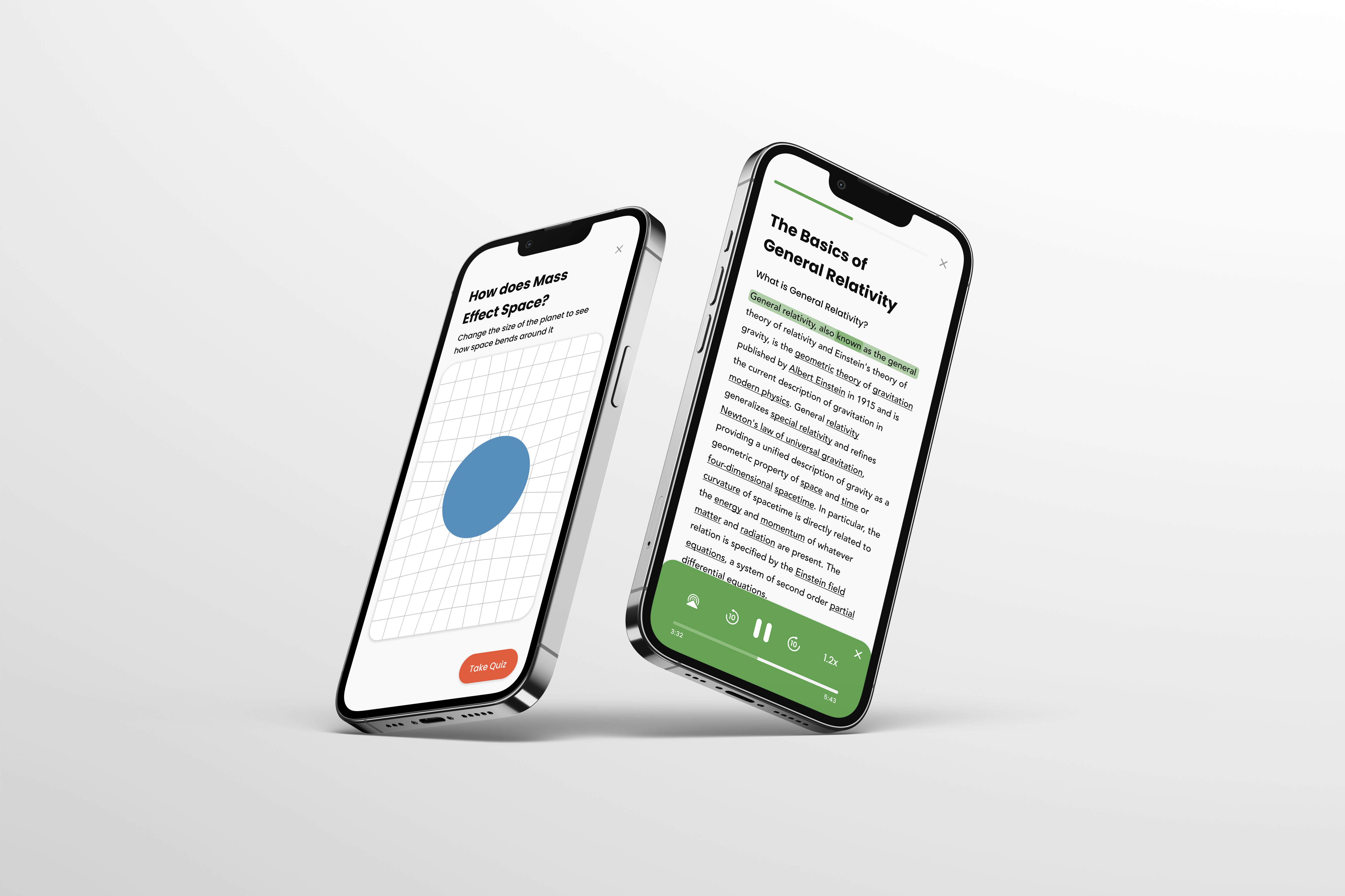
Hifi Prototype R3
After Testing the second revision of the app prototype I made final changes to the prototype based on the testing.
Hifi Prototype R1
Using my revised style tile I created a hifi prototype of the user flow and interface in Figma. This prototype is also where I began fleshing out various system elements. I then tested the app and collected notes on how the user interacted with the prototype.
Task List:
Start Lesson Select Method of Instruction Read Turn on reader Scroll Take Quiz Watch Pause Skip Ahead Take Quiz DoIt Change Values Take Quiz
Notes:Users attempted to click on calender Users hesitated when picking method of instruction Users accidentally closed app when swiping up to start lesson User thought well done screen lasted too long Audio controls cover “take quiz“ button on the read screen
Notes: